Today I did some bug fixes and improves on DPNT
GermanPurals HTML CSS javascriptToday I did some bug fixes and improves on DPNT (yes, I know, I need to come up with a better name…). First thing was to implement a randomized pattern for the questions to follow (so they don’t repeat), as seen in Bratacha. Each game is presently limited to ten questions, after which the user’s score is displayed, and they are returned to the main screen.
However, these words, should they be topic driven? Or just random from some list? I think topics is better suited to learning words (for instance fruit; Apfel-Apple, Erdberre-Strawberry, etc), and maybe instead levels (ie. A1, A2 etc) for such plural formation testing. One can, however, still learn new words using this application. For instance, when the user hovers the mouse over the question word, the Deutsch noun is replaced by the English translation (in complete lower case). This is achieved by listening to the onmousemove method.
//check when the house is hovering over the question word
window.onmousemove = function handleMouseMove(event)
{
    if( event.clientX >= 0.3*window.innerWidth && event.clientX <=
        0.7*window.innerWidth && event.clientY >= 0.14*$(window).height()
        && event.clientY <= 0.35*$(window).height() )
    {
        displayQuestionWord("English");
    }
    else
    {
        displayQuestionWord("Deutsch");
    }
}
Here I’m using $(window).width and $(window).height to get the actual usable window width and height as opposed to the browsers height, and displayQuestionWord() is a method which changes the value of the question word HTML element. A new list of English words is utilized, and so another jQuery get request, and readable array. In a future version this could be a toggle-able setting (stored as a cookie).
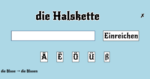
Another thing that the application presently lacks is feedback on the user’s answer. This is achieved in two ways. Firstly, a correct/incorrect symbol is displayed in the top right corner, and secondly, when the user answers incorrectly, the correct answer to the previous question is displayed on the bottom left corner.

So in the above example, the user failed to answer ‘Blusen’ correctly, so an incorrect symbol is displayed (for 1s) in the top-right, and the correct answer in the bottom-left until the next round.
Presently there are some UI presentation bugs (Umlauts in boxes, centering the question word etc.), and one annoying bug that sometimes the lists don’t load correctly. Nevertheless, it does work pretty well on Chrome and Safari (the UI boxes in Firefox aren’t great), and even is okay on Chrome and Safari on the iPad. On the phone I find Spiel One to be annoying, but then again I designed this for my on personal use, predominately on the desktop.
The present version can be played here. Let me know of feature requests, opinions, suggestions for a name etc.