50 Unity Tips #26: Decorator Drawers
Unity UnityTipsTricks UnityToolsA DecoratorDrawer is similar to a PropertyDrawer, except that it doesn’t draw a property but rather a decorative element based on a PropertyAttribute. Unlike property drawers, a decorator drawer isn’t associated with property fields, however it still needs to be placed above a field. Another difference is that there can be multiple DecoratorDrawer attributes above the same field. Also, unlike property drawers, if a DecoratorDrawer attribute is placed above a List or an array property field, the decorator will only show up once before the array and not for every array element.
In #15-PimpTheInspector we discussed the [Header], [Space], [ToolTip] attributes which are examples of built-in decorator drawers. In fact, we can define our own custom PropertyAttributes and state how they should be draw in the inspector by extending the DecoratorDrawer class.
Color Line
Lets say that we’d like to draw a line with a given width, height, vertical padding and color to visually separate parts of the inspector. Firstly we define the custom property attribute:
/// <summary>A decorative attribute to draw a colored line in the inspector.</summary>
public sealed class ColorLineAttribute : PropertyAttribute
{
    /// <summary>The default width.</summary>
    private const float DEFAULT_WIDTH = 0.5f;
    /// <summary>The default height.</summary>
    private const float DEFAULT_HEIGHT = 3f;
    /// <summary>The default padding.</summary>
    private const float DEFAULT_PADDING = 5f;

    /// <summary>The line's width. This can either be a fixed value (i.e. 100) or relative to the inspector's width (i.e. 0.9).</summary>
    public float width { get; private set; }
    /// <summary>The line's height. This can either be a fixed value (i.e. 3) or relative to the inspector's width (i.e. 0.05).</summary>
    public float height { get; private set; }
    /// <summary>The vertical padding around the line. This can either be a fixed value (i.e. 5) or relative to the inspector's width (i.e. 0.1).</summary>
    public float padding { get; private set; }
    /// <summary>The line's color.</summary>
    public Color color { get; private set; }

    /// <summary>The attribute's constructor.</summary>
    /// <param name="width">The width.</param>
    /// <param name="height">The height.</param>
    /// <param name="padding">The padding.</param>
    /// <param name="r">The red value (between 0 and 1).</param>
    /// <param name="g">The green value (between 0 and 1).</param>
    /// <param name="b">The blue value (between 0 and 1).</param>
    public ColorLineAttribute(float width=DEFAULT_WIDTH, float height=DEFAULT_HEIGHT, float padding=DEFAULT_PADDING, float r=1f, float g=0f, float b=0f)
    {
        this.width = width > 0 ? width : DEFAULT_WIDTH;
        this.height = height > 0 ? height : DEFAULT_HEIGHT;
        this.padding = padding > 0 ? padding : DEFAULT_PADDING;
        color = (r >= 0 && r <= 1 && g >= 0 && g <= 1 && b >= 0 && b <= 1 ? new Color(r, g, b) : Color.red);
    }
}
and then define how this property attribute should be drawn:
/// <summary>A custom property drawer for the ColorLine attribute.</summary>
[CustomPropertyDrawer(typeof(ColorLineAttribute))]
public class ColorLineAttributeDrawer : DecoratorDrawer
{
    /// <summary>The ColorLine attribute.</summary>
    private ColorLineAttribute colorLine
    {
        get { return (ColorLineAttribute)attribute; }
    }

    /// <summary>The line's vertical padding.</summary>
    private float padding
    {
        get { return colorLine.padding > 1 ? colorLine.padding : colorLine.padding*Screen.height; }
    }

    /// <summary>Callback to specify how tall the GUI for this decorator in pixels is. Default is 1 line high.</summary>
    /// <returns>The height in pixels.</returns>
    public override float GetHeight()
    {
        return base.GetHeight() + 2*padding;
    }

    /// <summary>Callback to make a custom GUI for this decorator.</summary>
    /// <param name="position">Rectangle on the screen to use for the decorator GUI.</param>
    public override void OnGUI(Rect position)
    {
        //firstly calculate the line's width and height (either fixed or proportional)
        float width = colorLine.width > 1 ? colorLine.width : colorLine.width*Screen.width;
        float height = colorLine.height > 1 ? colorLine.height : colorLine.height*Screen.height;

        //next calculate the line's start x, y positions
        float x = (position.x + (position.width / 2)) - width / 2;
        float y = position.y + padding + height / 2;

        //finally draw the line (by using the built in white pixel texture, tinted with GUI.color)
        Color currentGUIColor = GUI.color; //make a reference to the current color
        GUI.color = colorLine.color;
        EditorGUI.DrawPreviewTexture(new Rect(x, y, width, height), Texture2D.whiteTexture);
        GUI.color = currentGUIColor; //reset
    }
}
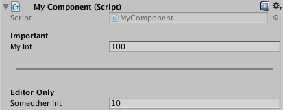
This property attribute can then be easily used as follows:
public class MyComponent : MonoBehaviour
{
    [Header("Important")]
    [SerializeField] private int myInt = 100;

    [Space(15)]
    [ColorLine(width: 0.9f, height: 3, padding: 5, r: 0.5f, g: 0.5f, b: 0.5f)]

    [Header("Editor Only")]
    [SerializeField] private int someotherInt = 10;
}
Conclusion
By using DecoratorDrawer attributes, we can customize how decorative elements are drawn in the inspector. These decorative elements are a quick and easy approach to visually organizing the inspector without having to define a CustomEditor.
Further Reading
50 Unity Tips - #15 Pimp the Inspector
50 Unity Tips - #25 Property Drawers
This post was generated from a GitHub repository.