Learning Flutter: twitter_ui
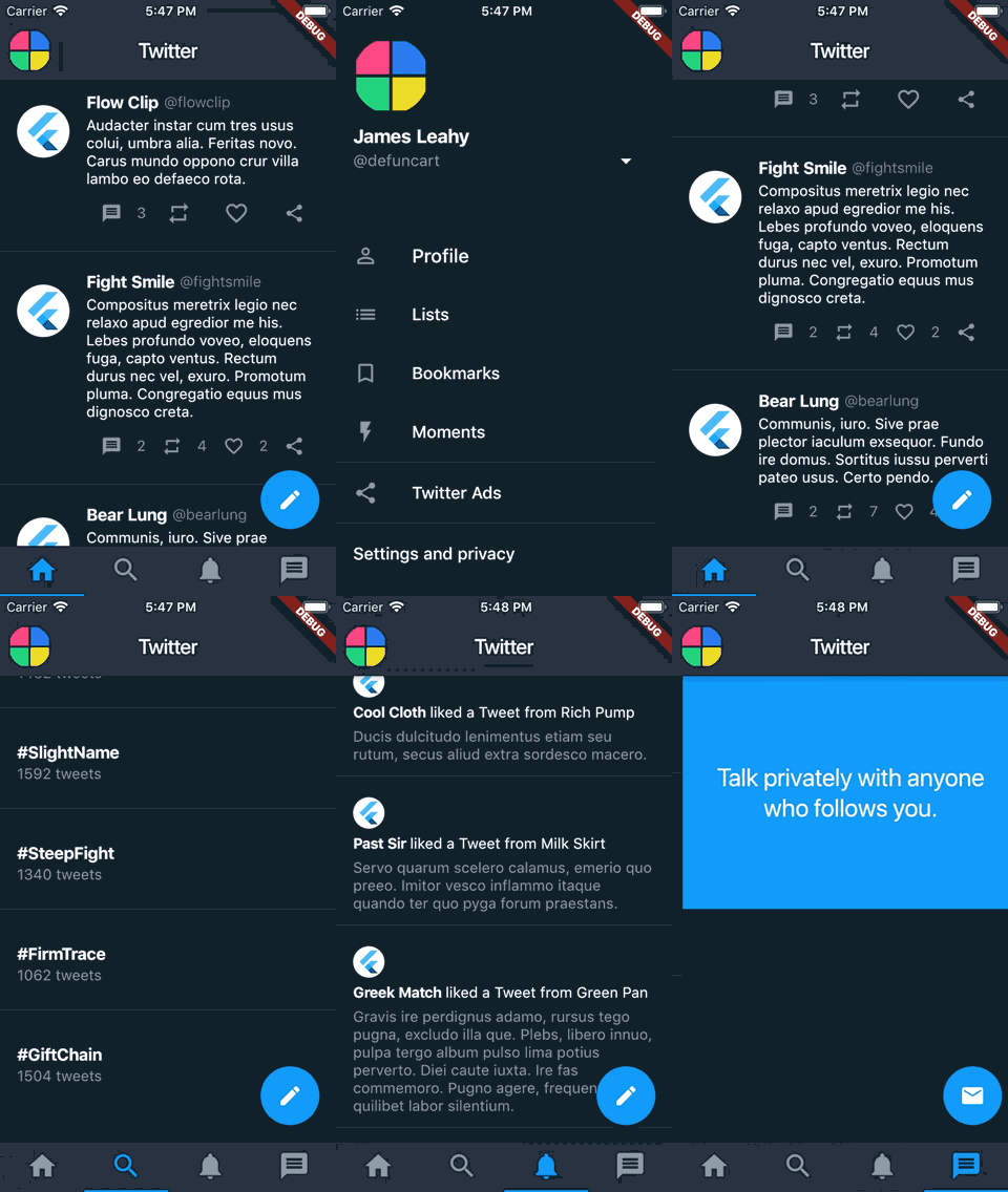
Flutter LearningFlutterA simple Flutter project (roughly) replicating Twitter’s main screen UI.

Overview
- User, Tweet, Trend and Notification are models representing a user, tweet etc.
- TwitterService returns a pre-defined user (me!), some fake tweets, trends and notifications using english_words and flutter_lorem packages.
- The app’s colors are defined in AppColors and used to style the app’s theme.
- The app only contains one screen, HomeScreen, which contains a drawer NavigationDrawer and a TabBarView.
- HomeTab, SearchTab, NotificationsTab and InboxTab are custom (tab) widgets.
- TweetWidget, TrendWidget and NotificationWidget are custom widgets for a tweet etc.
- As the app makes use of NetworkImage, INTERNET is added as a permission in the (main) AndroidManifest. Note that there is no error handling, so if the device doesn’t have an internet connection, an exception will be thrown.
Remarks
- In dart the keyword new is optional, thus for readability I have omitted it.
- Splitting widgets to methods is a performance anti-pattern (see below for more information), thus anytime a widget could be redrawn, I opted for custom widgets over methods.
- I am impressed the speed at which one can build simple UIs. Initially I was quite skeptical in having to write all ui code manually, but these widgets are insanely powerful and intuitive.
- I’m still not sure how to structure a flutter project. models, services and utils folders make sense, but I am not sure how to really organize the views.
- For custom widgets it seems to be generally best to supply a key so that the widget can be reference to later now. This is something I will look into more.
- The release build (without any optimization) is 19.26MB and 28.5MB on Android and iOS respectively.
References
Splitting widgets to methods is a performance anti-pattern
Never ever use functions over classes to make reusable widget-tree
Should I add a Key property to my custom widgets?
This post was generated from a GitHub repository.