Learning Flutter: slack_onboarding
Flutter LearningFlutterA simple app inspired by the first page of Slack’s onboarding.

The goals of this project were:
- to create an adaptive UI using proportional widths, heights and font sizes
- to explore basic animations for widgets like fade-in and slide-down
Overview
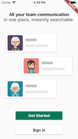
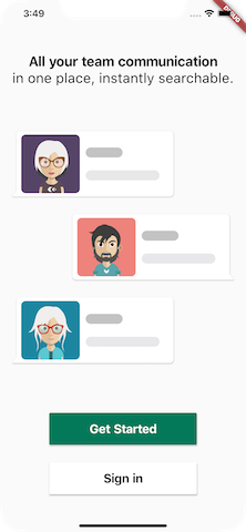
- The onboarding page is divided into three sections, top, middle and bottom, whose elements sizes are proportional to the screen width and height, and animate according to a specified timeline.
- The chat bubbles are created using the bubble package by Victor Dunaev, with avatar assets by kubanek. The chat message is simply created using a filled container with circular border radius.
Remarks
- By considering proportional widths and heights for widgets and proportional font sizes, it is possible to to adapt to devices of different resolutions and aspect ratios:
 |
 |
|---|---|
| iPhone 5s | iPhone XS Max |
| 640×1136 (9:16) | 1242x2688 (9:19.5) |
- Although this approach also works for iPad in portrait, practically a separate design would generally be needed as the elements would be far too big.
- It does not seem to be possible to animate a column (see bottom_section), or maybe I missed something?
- With regard to project structure, /configs seems like a better place for constants than /utils.
Resources
People wearing accesories avatar collection vector created by kubanek - www.freepik.com
This post was generated from a GitHub repository.